Content Editor, Dunham | 2025 ThinkAdvisor Luminaries Award Winner | 2026 Wealthies Finalist, Thought Leader of the Year | Macroeconomics, markets, geopolitics & global trends
U.S. Manufacturing Is Finally Showing Signs of Life
U.S. manufacturing just posted its strongest signal since 2022, with new orders and backlogs flipping into expansion after nearly a year in the doldrums.
If the momentum holds, the data point to the early innings of a new manufacturing boom following years of stagnation.
Why it matters: This is the clearest sign in years that U.S. manufacturing may be coming back to life. While some of the strength likely reflects post-holiday restocking, the size of the jump - paired with sharply lower customer inventories - suggests demand is rebuilding faster than factories can keep up. If it sticks, this could help support growth, ease inflation through higher supply, and reduce reliance on imports - all while reminding us that this rebound, though promising, remains fragile amid tariffs, geopolitics, and a stretched consumer.
The Deep Dive: Say what you want about the issues in the U.S. economy – but manufacturing just delivered one of its strongest signals in years.
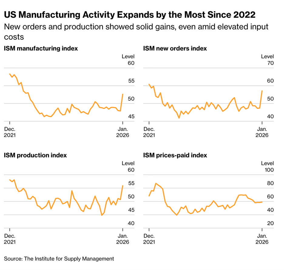
The Institute for Supply Management’s (ISM) Manufacturing PMI jumped to 52.6 in January - up from 47.9 in December – marking a four-point move that pushed the index back into expansion territory for the first time in nearly a year.
For context, readings >50 signal expansion, while anything 50< marks contraction.
This is significant because it’s a sharp rebound following almost twelve months of outright contraction - and a longer stretch of stagnation that’s lingered since 2022.
Thus, after years of grinding sideways, any real demand-driven momentum gets the eyebrows raised.
But, of course, the obvious question is whether this is .
a short-term spurt. Or the start of something more
Well, the evidence points toward the latter. . .
New orders surged nearly 10 points, production posted its fastest growth in almost four years as order backlogs expanded for the first time since 2022. And price pressures remained significantly below their prior June 2025 peak (59 vs. 69.7).
New Orders Index = the demand pipeline. It tells you whether customers are placing fresh orders or pulling back.
Backlog of Orders Index = unfinished business. It means factories have more work lined up than they can immediately fill.
Prices Paid Index = the inflation pressure gauge. It shows whether rising demand is spilling over into higher input costs.
That combination matters – but new orders are essentially the leading indicator of manufacturing activity.
Why? Because orders come first. Production follows. And backlogs build when demand starts running ahead of current capacity.
Put simply, if someone asked me what the one gauge to follow is – I would say new orders.
Furthermore, keep in mind that manufacturing - like any market - moves in cycles.
They boom. They bust.
Andsince 2021, U.S. manufacturing has been stuck in a prolonged bust phase – just stagnating along.
Thus, what we’re seeing now looks less like noise and more like an early attempt to break out of that multi-year rut.
And if this recovery holds, the implications stretch well beyond the manufacturing sector.
For instance - a healthier manufacturing base would help the U.S. ease inflation pressures through higher supply, while also reducing reliance on imports, a key lever in narrowing the trade deficit over time. It would also help economic growth.
That broader backdrop adds weight to the idea that this isn’t a one-off rebound - but part of a global manufacturing boom.
The point is, for the first time in years, manufacturing isn’t just sitting sideways - but showing signs of waking up.
Let’s see if it has legs to run and how it will impact the ongoing trade war.
Figure 1: Bloomberg, February 2026
China’s Debt Just Hit 300% of GDP - And It’ll Likely Go Far Higher
China’s debt load just crossed 300% of GDP, driven less by reckless borrowing and more by slowing nominal growth that’s turning debt math against the economy.
With hidden liabilities piling up and growth increasingly dependent on new borrowing, China is edging closer to a Japan-style trap where debt grows faster than the economy can absorb it.
Why it matters: When nominal growth (non-inflation-adjusted) stalls, debt ratios rise even if credit growth stays modest, trapping economies in a slow-growth loop that’s hard to escape. That’s because if you can’t “grow your way out of debt” – it becomes a problem. China is increasingly facing a denominator problem as growth is slowing relative to debt rising - a dynamic that is eerily similar to Japan’s post-bubble era and helps explain why Beijing now needs stronger nominal growth - or even inflation - more than it’s willing to publicly admit.
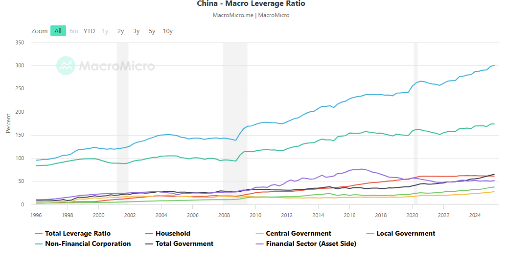
Now the Deep Dive: China’s macro-leverage (total debt relative to the economy) has surpassed a whopping 300% - up from 242% the quarter before COVID 6 years ago.
That’s a staggering level on its own. But what should really grab your attention isn’t just the size of the debt - it’s the speed.
Why? Because in markets and economics, it’s often the rate of change(trend) that does the damage – not the stock (total level).
Think of it this way. You have a $100,000 bank balance. That’s your stock. But the inflows and outflows - the cash moving in and out - are the flows. And it's those flows that'll determine where the balance is headed next.
Thus, by that measure, China’s direction is concerning.
In 2025 alone the macro-leverage ratio jumped 11.8-points, topping 2024’s 10.1-point increase.
Outside of 2025, there’s only one year when debt rose faster - 2020, at the peak of COVID.
For the first two decades of this century, the world cheered China’s miracle expansion. Hitting growth at a pace no major economy had ever sustained before in such a short period of time.
But in the process, it forgot one simple fact: all hypergrowth is imbalanced growth.
Meaning this growth was fueled by cheap credit and flooding capital into the sectors Beijing wanted to grow.
Think of it like keeping a bonfire roaring by constantly pouring gasoline on it - it burns hot and fast, but it’s not a sustainable flame. And once the fuel slows, you see how weak the flame is and how burned out the logs and pit truly are.
Worse is that the ~300% figure likely understates the real picture.
China’s debt system is opaque - riddled with off-balance-sheet obligations, local-government financing vehicles (LGFVs), and other hidden liabilities.
Add in the rise in “abnormal” corporate payables and receivables - often a sign of delayed payments rather than stronger revenues - and the picture looks darker.
The point is, China’s struggling to hit aggressive growth targets without leaning on debt. And if policymakers keep aiming for growth north of 5%, borrowing will likely keep rising too, stabilizing activity in the short run, while fueling instability for later.
The bonfire can keep burning - as long as someone keeps pouring more and more fuel on it.
F
i
gure 2: MacroMicro.me, February 2026
Truflation vs. CPI: Why Real-Time Inflation Data May Be Sending a Different Signal
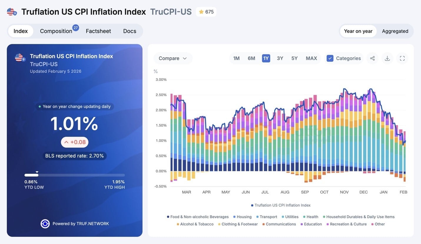
Real-time inflation data from Truflation suggest price pressures may already be closer to 1–1.5%, well below what headline CPI currently shows.
Because CPI relies on lagged surveys and increasing data imputation, it may be slow to reflect cooling inflation - raising the risk of policy staying too tight for too long.
Why it matters: Official inflation data are backward-looking by design, meaning policymakers and markets may be reacting to stale information just as price pressures are easing. If inflation is cooling faster than headline CPI implies, the risk is that monetary policy stays tighter for longer than necessary - especially as growth slows and debt burdens rise.
Now the Deep Dive: If you haven’t heard of Truflation, you’re not alone. It launched in late 2021 to address a simple but growing problem, which was that official inflation measures - like the CPI and PCE - are slow, backward-looking, and based on limited samples.
Truflation was designed to take a different approach. Instead of relying on monthly surveys, it aggregates more than 13 million real-time prices every day from over 30 licensed data providers, producing a daily inflation gauge that updates continuously.
Furthermore, it uses blockchain infrastructure (like what Bitcoin uses for its public ledger) for transparency and auditability, yet relies on real-world prices.
And it’s this methodological difference that matters most.
Why? Because Truflation’s numbers won’t exactly match the government CPI – since they use different weights, sources, and timing.
But historically, Truflation’s trend has led official inflation data by roughly 45 to 70 days, making it a faster read on where inflation may be headed (not where it’s been).
That speed and transparency advantage has become even more important as the BLS has increasingly relied on “statistical quirks” to fill gaps in CPI data it can’t directly collect.
Sure, those adjustments may be necessary, but they add another layer of shadiness to an already lagging process, which helps explain why real-time measures like Truflation are important.
So what is Truflation showing today? It suggests inflation is cooling, with headline readings near 1.0% and core measures closer to 1.3–1.5%, even as official CPI and Core PCE remain far higher.
Please note that the gap doesn’t mean government data sets are “wrong” - it means they may be behind the curve. And if history means anything, official inflation gauges tend to follow where leading data move first.
In a world where growth is volatile, debt levels are high, and policy mistakes are costly, lagging inflation data can be just as dangerous as rising inflation itself.
For instance, if Truflation is right, then the inflation fight may already be further along than the headlines suggest – and the Fed may be very behind the curve, thus risking a potential slowdown or rapid rate cuts to catch up (either one catching markets off guard)
My point is: Yes, CPI matters. And no, Truflation isn’t flawless. But comparing the two beats trusting a single gauge - especially when so much rides on it.
Figure 3: Truflation, February 2026
Anyway, who knows how this will all play out?
This is just some food for thought as we watch how these trends develop.
We’ll be keeping a close eye on things. Enjoy the rest of your weekend.
This communication is general in nature and provided for educational and informational purposes only. It should not be considered or relied upon as legal, tax or investment advice or an investment recommendation, or as a substitute for legal or tax counsel. Any investment products or services named herein are for illustrative purposes only and should not be considered an offer to buy or sell, or an investment recommendation for, any specific security, strategy or investment product or service. Always consult a qualified professional or your own independent financial professional for personalized advice or investment recommendations tailored to your specific goals, individual situation, and risk tolerance. All examples are hypothetical and are for illustrative purposes only.
Information contained in the materials included is believed to be from reliable sources, but no representations or guarantees are made as to the accuracy or completeness of information. This document is provided for information purposes only and should not be considered as investment advice.
Dunham & Associates Investment Counsel, Inc. is a Registered Investment Adviser and Broker/Dealer. Member FINRA/SIPC. Advisory services and securities offered through Dunham & Associates Investment Counsel, Inc.
U.S. Manufacturing Booms, China’s Debt Hits 300% of GDP, & Inflation Is Cooling | Dunham